Concept, design and implementation
[in process]
Concept
I developed the graphic concept for Alexander Scull Castillo – Scull music for short. As a musician and professional percussionist, the vibration and rhythm should also be made clear through the logo font and the corresponding signe.
Design
Logo and Signe
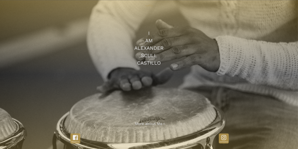
A photo of Alexander’s hands playing was used as the starting point for the logo. The shape was vectorized and worked out. The “vibration” of a conga was then added. The graphic hands enclose the vibration they have created.


The typography of the logo was then fine-tuned. The original font was converted into paths and fine-tuned. All spacing and spaces were revised accordingly and corresponding ligatures were created. These ligatures for the double lowercase L and the transition between the lowercase S and the i dot make the logo lettering unique and also allow the vibration to be felt.

Businesscard
Even as a professional musician, it is important these days to pass on your contacts. The business cards were designed with this purpose in mind. They were printed with Pantone Gold and white partial varnish and matt foil. This gives the business card an elegant and graceful appearance.


Website
Of course, a website is a must these days. For this reason, a simple contact and project website was created at www.scullmusic.com. After a short logo animation when opening the website, the visitor gets more information about Alexander and his projects. At the moment he himself is introduced and his project “Tempo Habana”. The website is written as a static website with Next.js and is hosted via Github-pages. It is available in 3 languages, English, German and Spanish.